Parts of a page
There is more to a page than just the content. Some aspects that aren’t displayed when viewing the page are still quite important. Several of these important aspects are editable on most or all pages in the CMS.
While editing a page you can see a preview of what the page will look like on the right hand side. Note that this preview doesn’t include the navbar and footer and that since it is rendered in real time instead of built like the public page there are occasionally some small differences between the live preview and what users will see.
Title
This is the title of the page. It is shown on the tab for the webpage in a user’s browser. It is also what is displayed in search engines as the link to navigate to your page. The words in your title can also impact what search times will allow users to find the page.
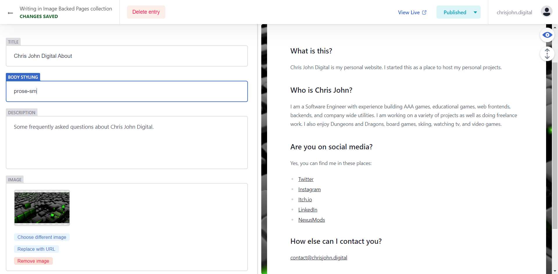
Body Styling
This is a field that allows you to apply existing css rules to the content of the page. You can’t add a new css rule here, but the site uses TailwindCSS for styling and so there is a wide selection of styling rules available to apply. This can be left blank, but it is available to help make some tweaks to the appearance of the page.
Description
The description is a short description of the page. It is the description of your page that users see under the title in a search engine results page. The contents of the description can help entice users to come to your website as well as help your pages rank higher for relevant queries.
Image
Some pages have an image as an important part of their template (Image Backed Pages, Image Left Pages, and the Homepage for example). This image is specified by selecting an image from the Media gallery (or you can specify the image with a url).
ImageAlt
The alt text for an image is incredibly important. This is displayed if the image fails to load and is also the text that a screen reader reads aloud. All images should have alt text.
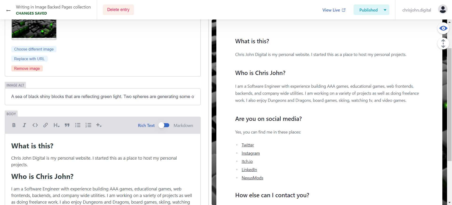
Body
This is the main content of the page. The CMS editor for markdown content allows you to use “Rich Text” mode or “Markdown” mode. In most cases “Rich Text” mode works great and provides an editor that allows editing somewhat similar to popular text editors. You can bold and italicize text, add a link, change the font size (by selecting a “Heading” type under the H drop down menu), insert bullet points and more. That said all of this is also do-able using markdown syntax in markdown mode. If you’re interested in learning more about markdown syntax there are many resources, but this one is a good starting point.
Editing the navbar
The navbar has a series of fields that control content in the navbar. The navbar is often customized per site so these options may not be exactly what you have available.
Logo
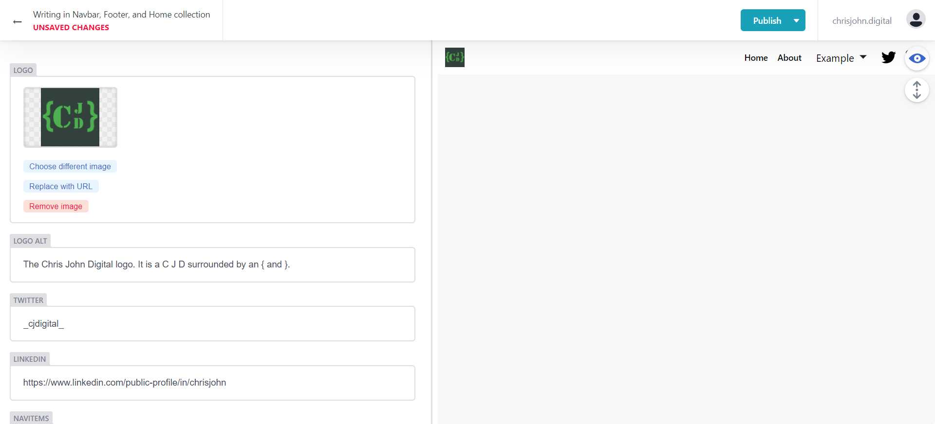 This is the logo displayed on the left hand side of the navbar. When a user clicks on it they are taken to the home page.
Logo Alt
The alt text for the logo. This is displayed if the image fails to load and is also the text that a screen reader reads aloud. All images should have alt text.
The twitter handle that is linked to by the twitter icon on the right side of the navbar.
The url for a linkedin page that is linked to by the LinkedIn icon on the right side of the navbar (note in the preview this might be behind the eye button that toggles the preview panel off and on).
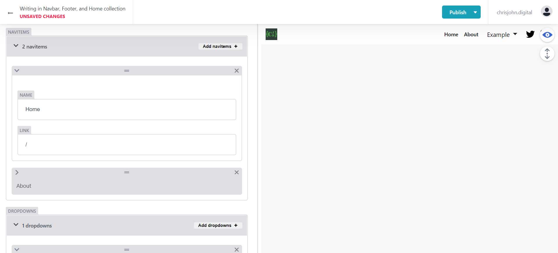
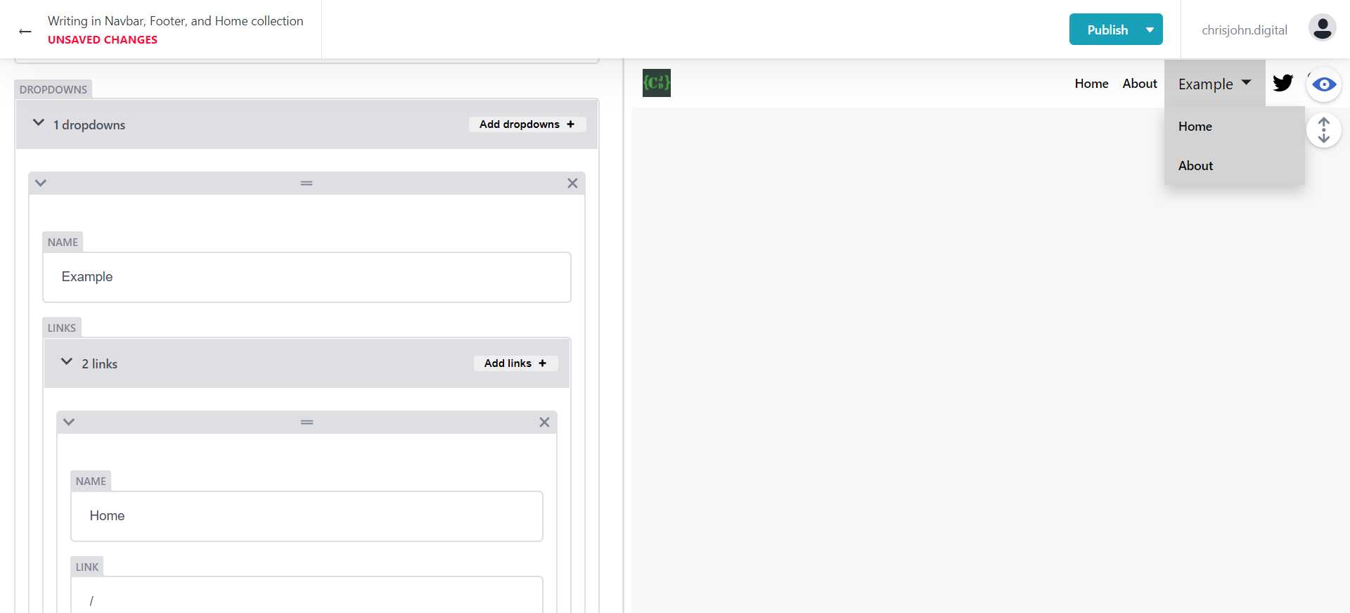
NavItems
This is the list of pages that are linked to in the navbar. Each navitem contains a “Name” which is the text the user sees and a “Link” which is the url path to reach the page.
Note that I’d suggest not having more than 6 items in the navbar where each link and each dropdown group count as a single item. The reason for this is partially due to keeping the number of options low so the UI feels manageable to users and partially because on smaller screens before switching to the mobile view the navbar can get very crowded with too many options.
Dropdowns
Dropdowns allow you to have links to several pages under one item in the navbar. This is a good way to reduce the number of items in the navbar, but still link to all the pages you want to link to.
Note that I’d suggest not having more than 6 items in the navbar where each link and each dropdown group count as a single item. The reason for this is partially due to keeping the number of options low so the UI feels manageable to users and partially because on smaller screens before switching to the mobile view the navbar can get very crowded with too many options.
Editing the footer
The footer has a lot of similarities to the Navbar. The footer is often customized per site so these options may not be exactly what you have available.
Logo
This is the logo displayed in the center towards the top of the footer. When a user clicks on it they are taken to the home page.
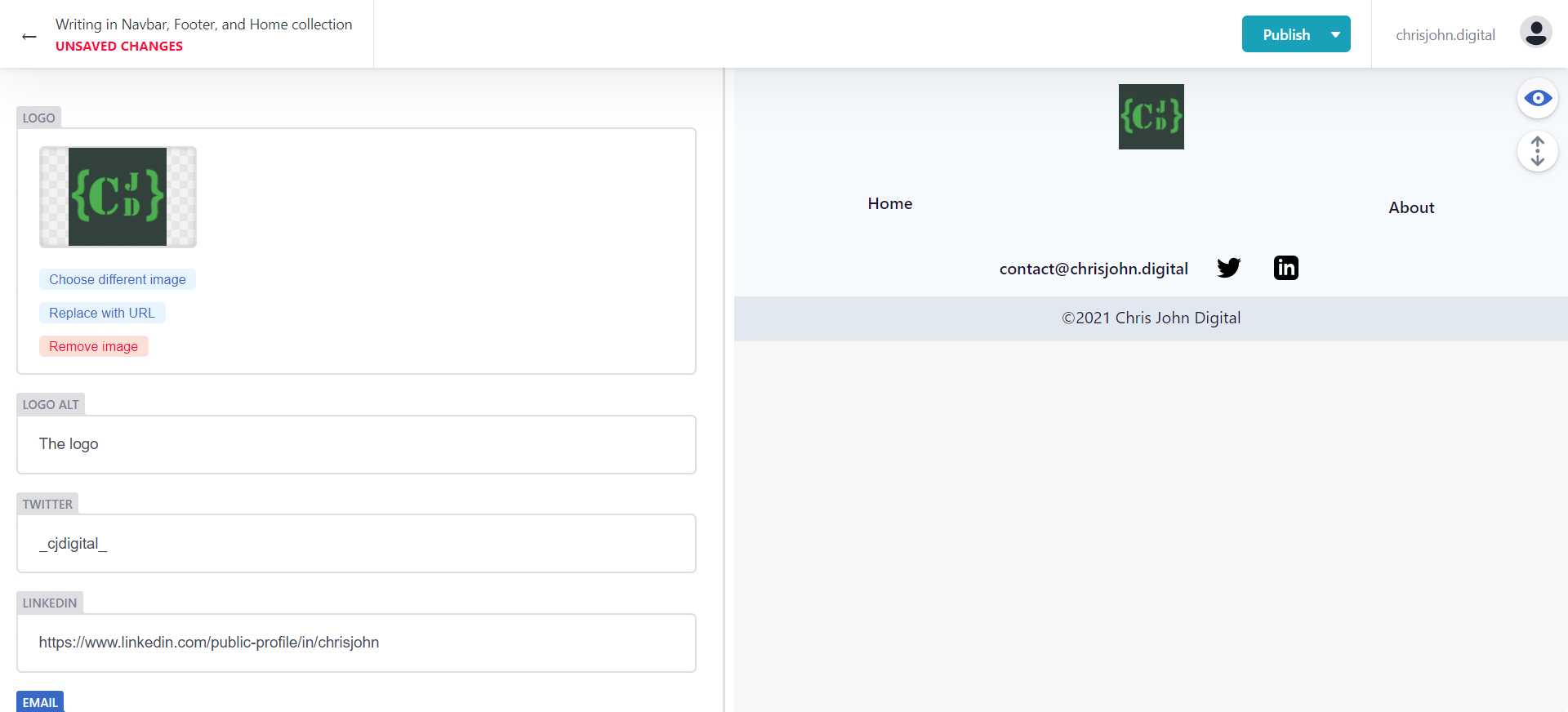
Logo Alt
The alt text for the logo. This is displayed if the image fails to load and is also the text that a screen reader reads aloud. All images should have alt text.
The twitter handle that is linked to by the twitter icon towards the bottom of the footer.
The url for a linkedin page that is linked to by the LinkedIn icon towards the bottom of the footer.
The contact email address to show at the bottom of the footer.
Copyright
This controls the text for the copyright statement at the bottom of the footer.
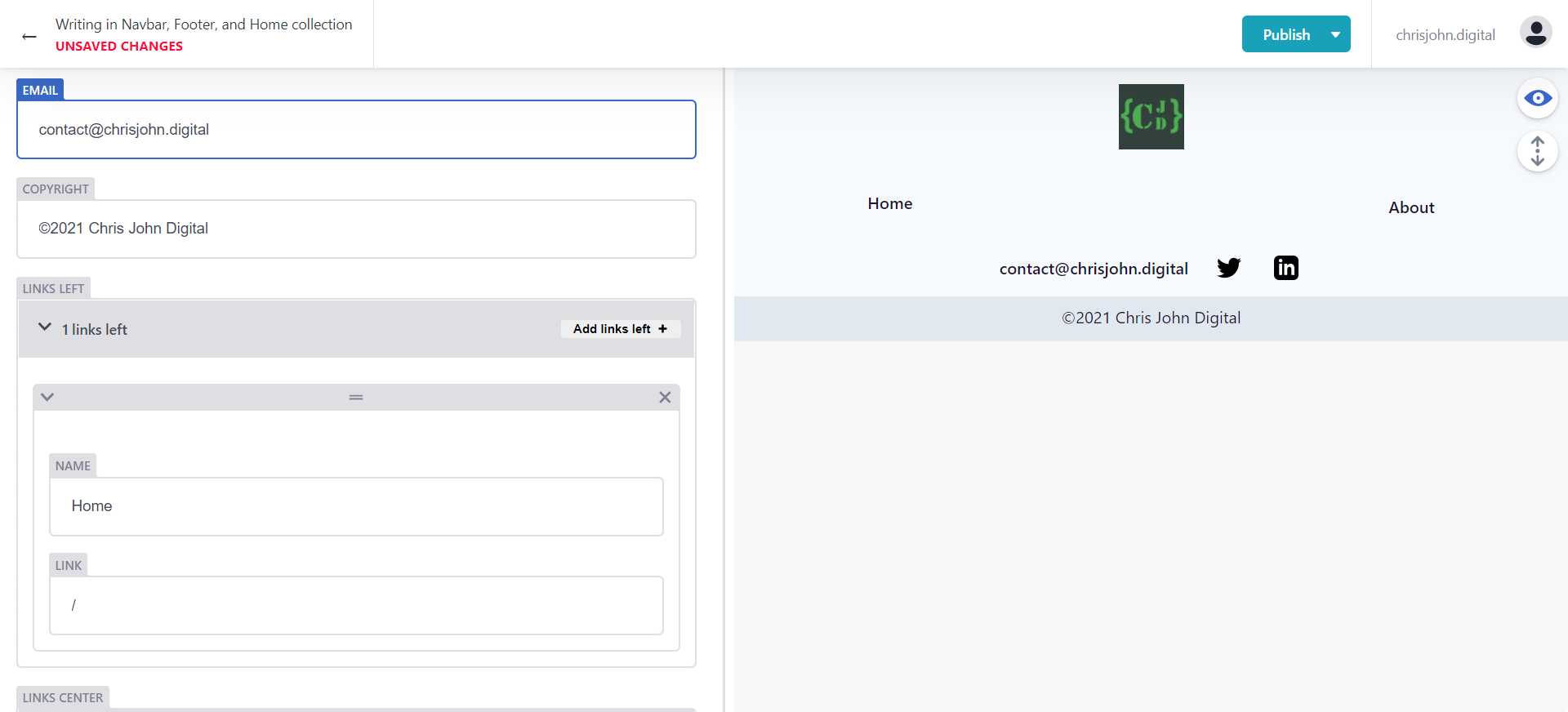
Links Left, Center, and Right
Links are shown in the footer in 3 columns. Each column has its own list of links that you can edit in the CMS UI. Each link item has a “Name” which is the text displayed for the user and a “Link” which is the path for the page that is being linked to.