Widgets/Components/Shortcodes
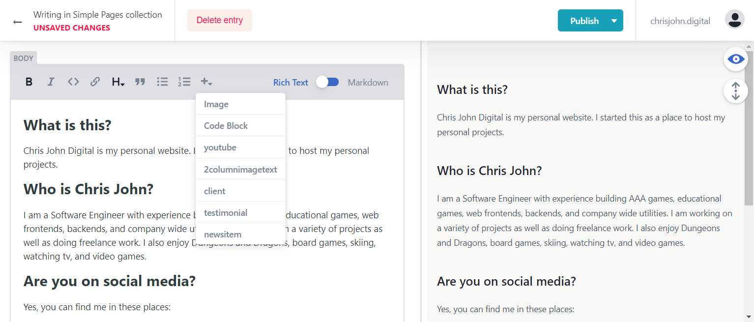 There are special widgets that can be added to the body of a page. Each of these have their own set of fields to provide that control their appearance and content. You can insert a widget by clicking on the + dropdown menu while in ‘Rich Text’ mode in a markdown input section.
Not all sites have all widgets. If there's a widget that you want available on your site or a custom widget you want developed for your site Contact Us
Image
This widget adds an image to the page. The size of the image will adjust based on the page size.
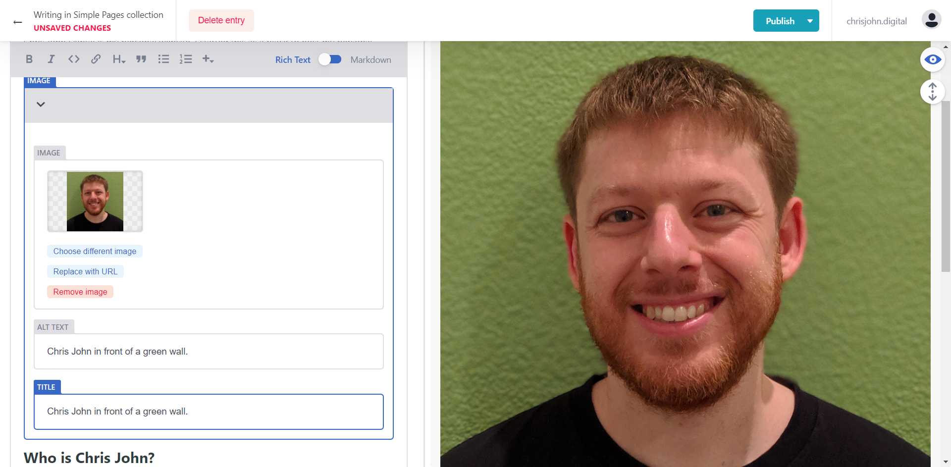
Image
The image that is displayed by the image widget. Choosing an image gives you the images uploaded in media as options. You can also provide a url for an image hosted elsewhere.
Alt Text
This is the text used by screen readers to provide more information about an image. Provide something descriptive here. This is also used by search engines to determine what the image/page is about.
Title
This is the text displayed when a user hovers over the image. You can provide information this way, but most users will likely never see it (unless you make it a point like https://xkcd.com).
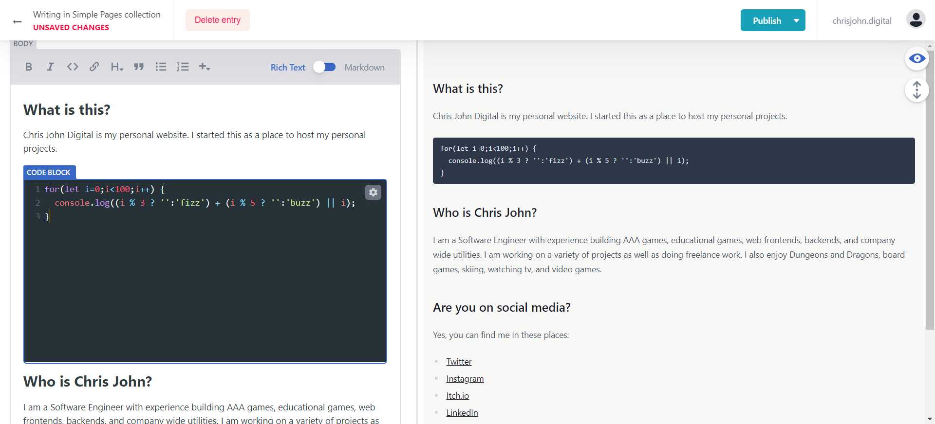
Code Block
The settings icon gives you options for the code block. For the most part though just type the code you want to display.
Note that this is a great option for text you want monospaced.
YouTube
This embeds a YouTube video on the page. The size of the video will adjust based on page size.
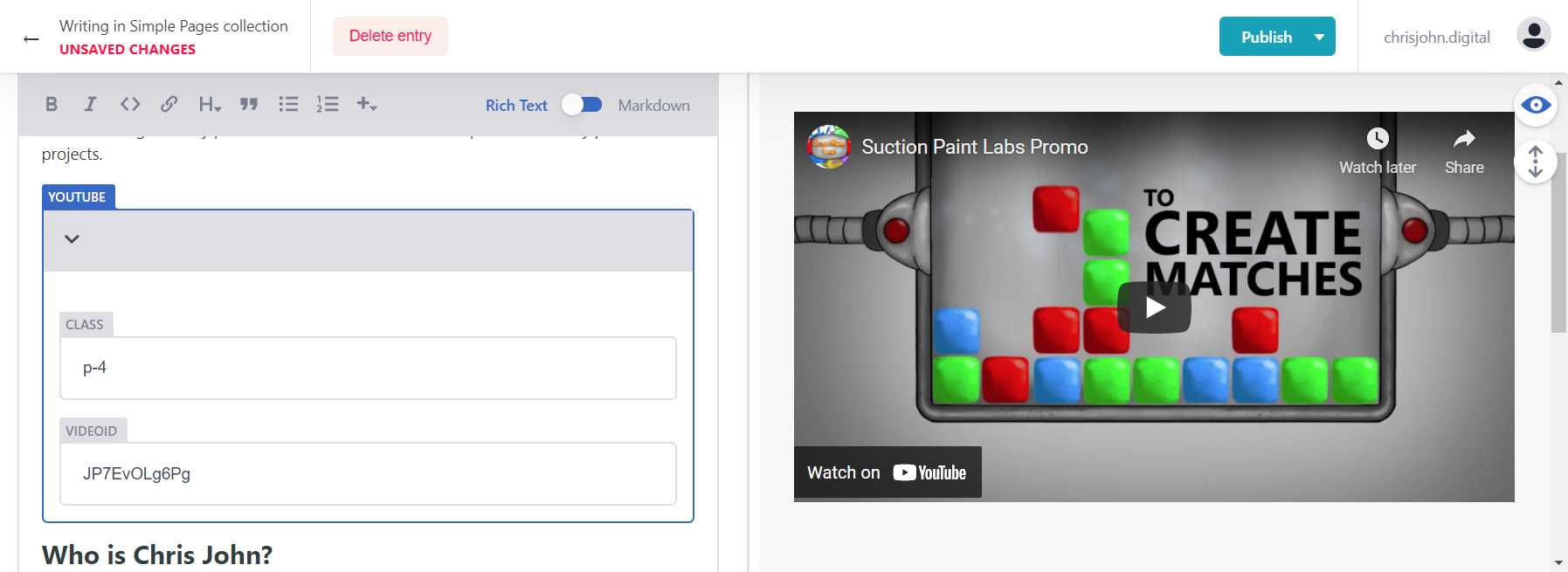
Class
This is a place to specify css class(es) that are applied to the youtube widget. You can use styles defined by TailwindCSS. Note that the widget will adjust its size based on the screen width already.
VideoId
This is the id of the video that you want embedded. In a YouTube url this is the part after “v=”.
2ColumImageText
This adds a widget that has 2 columns with one of them an image and one of them text that can be styled with markdown syntax. This widget automatically adjusts based on the page width. On larger devices the image defaults to the left side and the text defaults to the right side. On smaller devices because side by side content would not fit well the image defaults to the top and the text to the bottom.
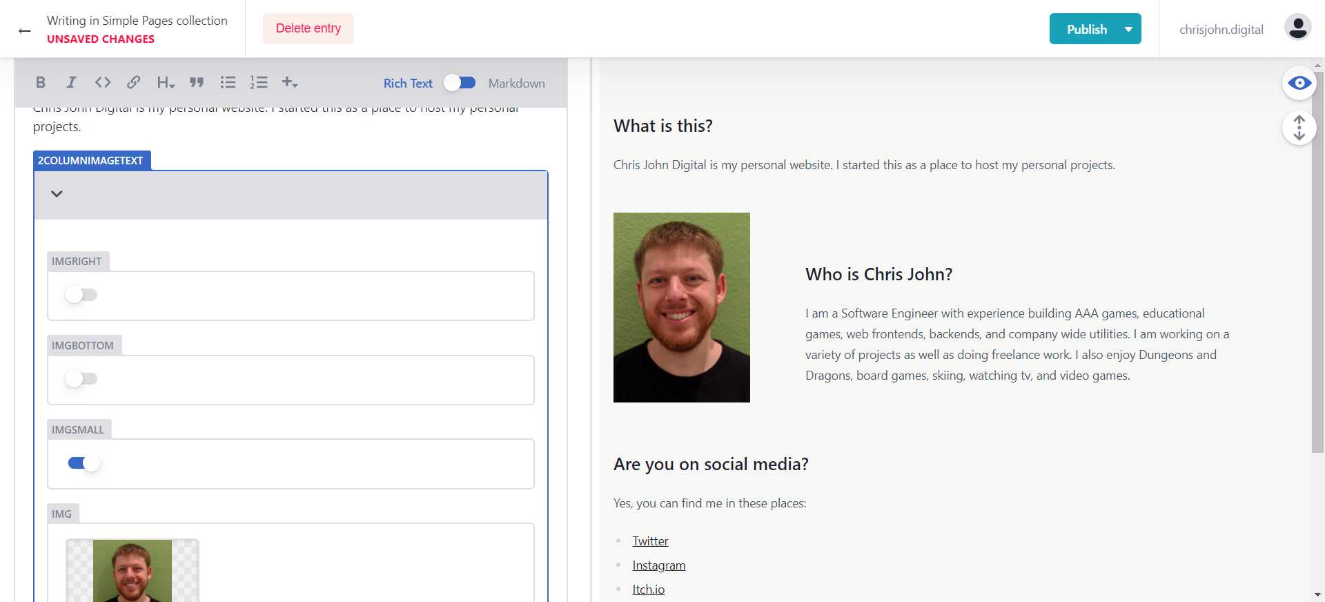
ImgRight
This is a toggle that controls which side of the page the image is on.
ImgBottom
This is a toggle that controls whether the image is top or bottom on smaller devices.
ImgSmall
By default each column is the same width. When this is toggled on the image is set to a smaller size.
Img
The image to display. This is selected from the Media library.
ImgAlt
This is the text used by screen readers to provide more information about an image. Provide something descriptive here. This is also used by search engines to determine what the image/page is about.
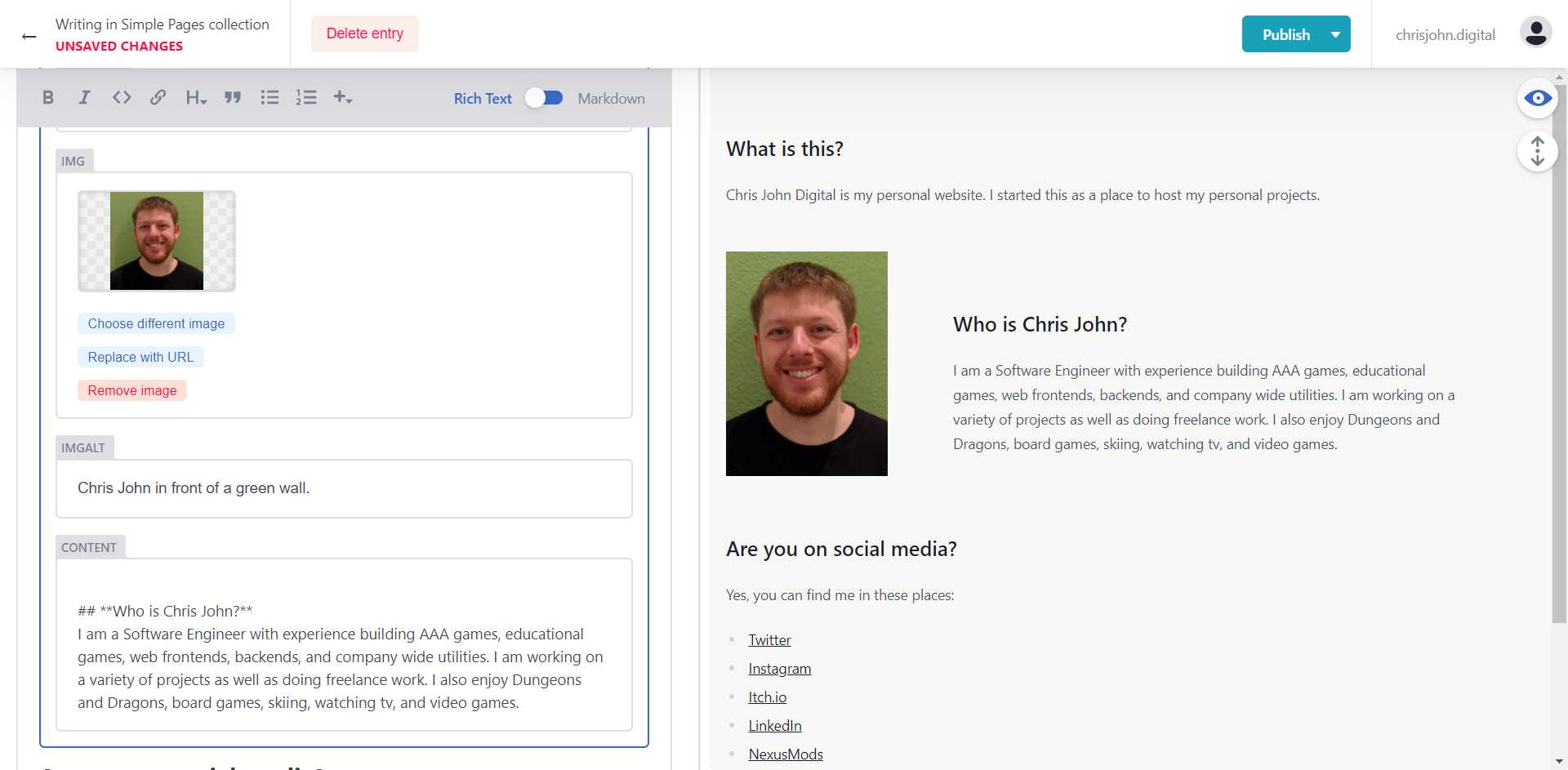
Content
This is the content that shows in the text section of the widget. Markdown syntax is valid in here even if the editor side of the screen doesn’t make that easy.
There is a current bug in the CMS library that means when editing in this box the cursor will constantly jump to the end of the text box. This can be avoided by editing the content in markdown mode
Client
This widget is designed to display some basic information about a client.
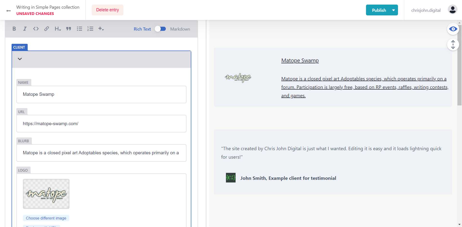
Name
The name of the client.
URL
The url for the client’s webpage.
Blurb
Short text field where you can provide some information about the client. This is optional.
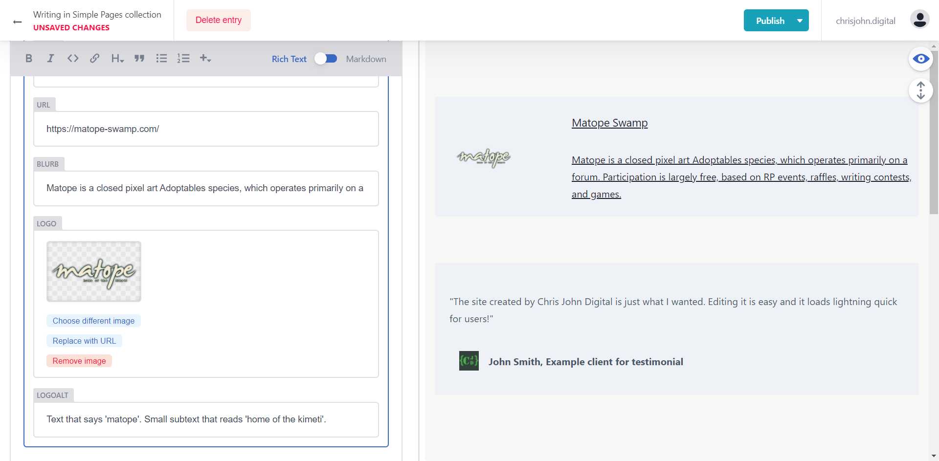
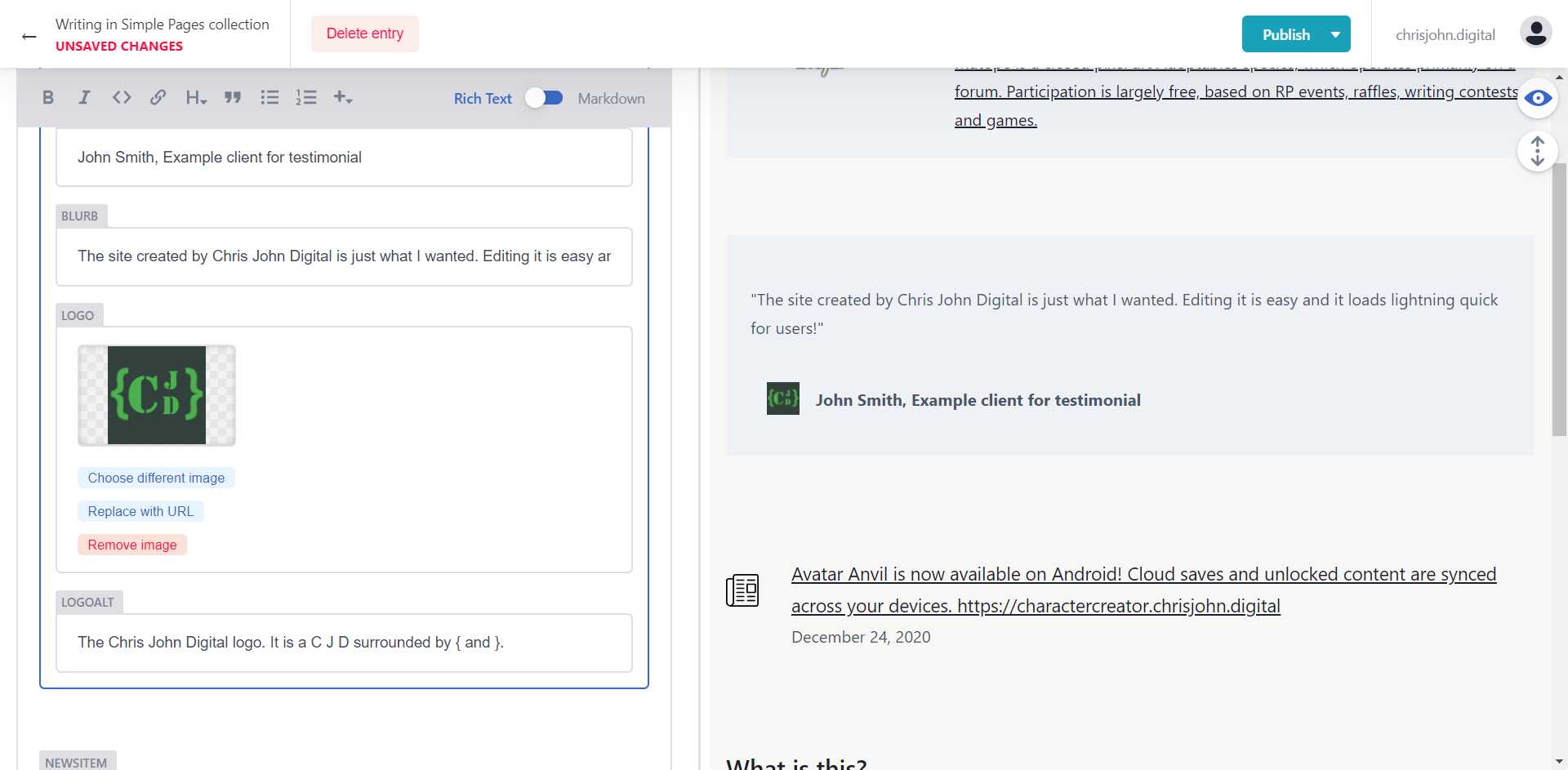
Logo
The client’s logo. This is selected from the media library.
LogoAlt
The alt text for the logo. This is displayed if the image fails to load and is also the text that a screen reader reads aloud. All images should have alt text.
Testimonial
This is a widget designed to provide a testimonial quote from a client/user about your service/product.
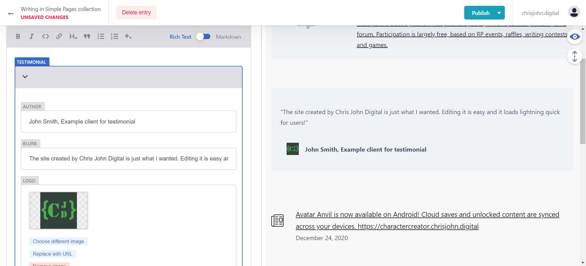
Author
The author of the testimonial.
Blurb
Short text field to provide what the author said.
Logo
The speaker/client’s logo. This is selected from the media library.
LogoAlt
The alt text for the logo. This is displayed if the image fails to load and is also the text that a screen reader reads aloud. All images should have alt text.
NewsItem
This is designed to show news items or articles you want to link to.
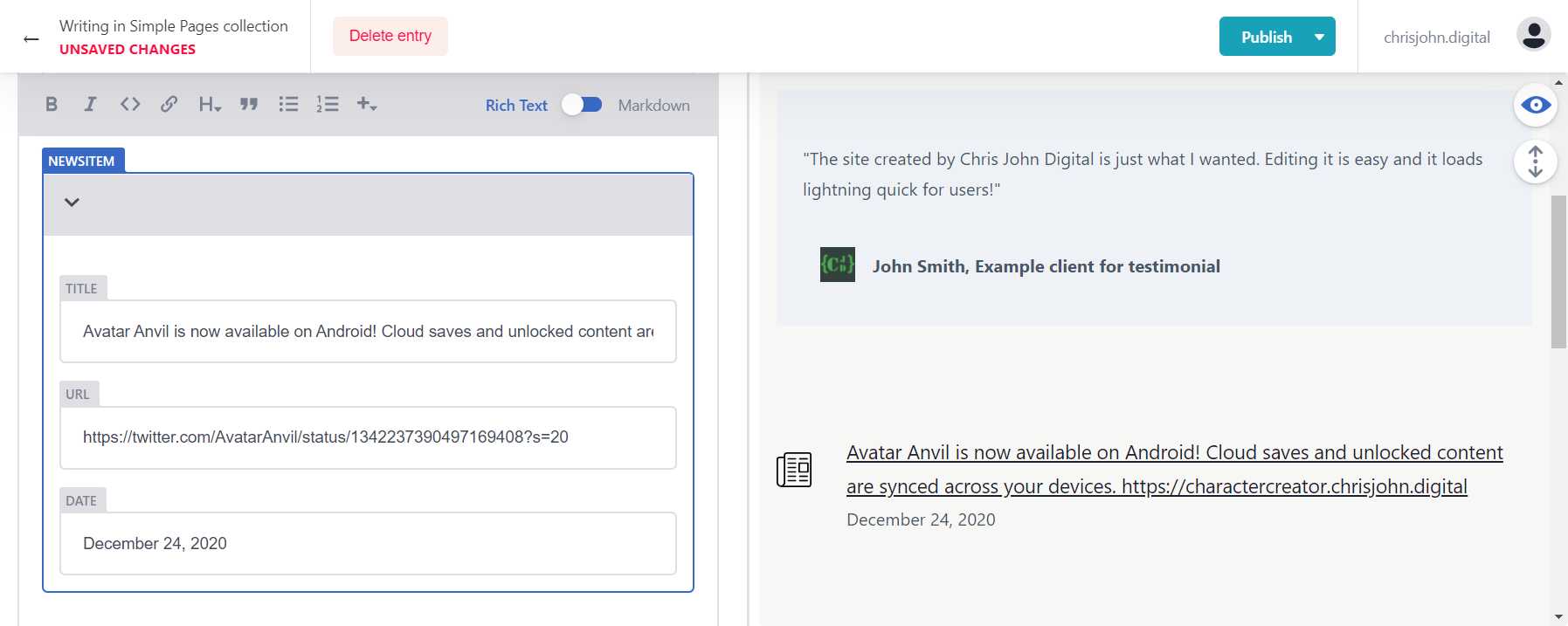
Title
The main text of the link to the article.
URL
The url of the article.
Date
The date of the article. This is a text field so you can also use this to communicate other information as desired. This field is optional.